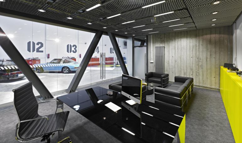
The idea for the place's arrangement was born when someone half-jokingly suggested "what if?". This is how the office interiors for the T2 Investment company were combined with a garage. As a result, motoring has become the theme organising the interior.
The investor's private passion became the foundation for the building's visual identity. It gave the interior and the exterior of the storehouse a consistent character. The architects decided to match the appearance of technical, garage and parking spaces, creating an uniform, main theme for the building's architectural design. A colour code typical for race courses (yellow and graphite stripes) appears in the whole building consistently. Similar graphic designs also feature on the storehouse's elevation, therefore it resembles slightly the appearance of a real garage or a warehouse. All the entrances to the building are joined by a reinforced concrete roofing, proceeding into a flowerbed with a bench.
Garage and office in one
All of the rooms of the T2 Investment office are separated from the garage hall only with a glazed wall. Before the building works commenced, the investor wanted to transport the vehicles somewhere else, but due to a joint decision they were left there and the garage part of the concourse was joined with the office interior on the basis of a variable exposition. It's worth stressing, that the garage is not a "mock-up" - the workshop is equipped with an exhaust system, a lift and tool lockers. After the working hours, the director working under a car's bonnet is a common sight here. Individual cars have their own numbered spaces, looking as if they are on a race course and ready to go.
Motoring associations are clear but not overwhelming. Even more so, because after closing the curtains between the garage and the office part nothing indicates the use of the second part of the storehouse: The office and the garage can be completely separated – says Marcin Kosciuch from a Poznan's design agency Ultra Architects . When the company is meeting with clients, they have no idea what is behind the wall. Obviously, the characteristic elements like the yellow furniture in all the rooms remain, including the reception desk and a coffee table made of a car tire. But even the colour yellow present everywhere does not have to reveal the investor's interests. As the architect explains, an interior arrangement and its idea should be highlighted, but still neutral: An interior has to overpower the chaos, it has to be clearly defined but do not feel intrusive at the same time. Yellow highlights, a few details are enough. However, we would not recommend here for instance bright red walls or floors, which would strike as very strong from the very first step inside.
Offices for rent
The biggest platform for the architects' creativity was a space of 300 square metres, which the investor had allocated for his company's office. The rest, which is part of the first and ground floor, coming up to about 70 per cent of the whole space, was set to be offices for rent. This space was designed to be very neutral, but with a character of it own. The exterior facade of this side of the building was also restored, the signs of its history were maintained and the focus was put on the minimalistic and postproduction style. The space intended for a general user was designed to be very flexible and easy to modify. It's worth paying attention to an electrical installation with lighting elements. In case of disassembling particular partitions (creating an open space office) the electrical system could be easily installed in another location, and be adapted to the lessee's specific needs.
To demolish or to build?
The storehouse quickly became an office facility. As Marcin Kosciuch of Ultra Architects tells us, the revitalization of the storehouse was a good decision: We have too much space that we should be using. Basing an office arrangement on the way the building is already formed in is ecological and economical, so revitalization is not just a "positive" trend but a necessity, just like energy-saving technologies. The investor bought a storehouse, which was of the right hight for another storey to be built inside. The storehouse was weather proof from the outside, the technical condition was alright, plus we found its dimensions satisfying. Therefore a decision to demolish the storehouse and build a new one would have been unjustified.
However, there have been problems - during the building works the storehouse turned out to had been built of random materials. The architects dealt with it by using trusses amongst others, which braces the building well across. V-shaped pillars not only allow to create more motoring associations, but they also support the added storey well (which is lit by skylights). The technical, concrete flooring in the garage part has been left untouched. We did everything to save the original flooring. We adjusted the office's level to the flooring's level, to position the construction correctly, while avoiding damaging the floor –recall the architect.
Designing an office's interior is a very difficult task. Strong highlights of the motoring theme should be able to attract various personalities, who spend the biggest part of their day here, it should make them feel comfortable here. Unfortunately, we still recreate instead of creating, we equip our offices with trendy catalogue furniture, we do not design individually, for specific companies and the people in them. This is the biggest problem of Polish architecture– reckons Marcin Kosciuch.


