


The project of the Main Office of Jeronimo Martins Poland is an example of creating visual identification of a company, however departing from signs and colors which bring to mind clear associations with a popular chain. A binding arrangement of shops was not our inspiration, we wanted to terminate it, also at the request of an ordering party. However trivial it may sounds, we have been looking for a natural environment for “ladybirds”, that is Polish meadow, full of flowers and green – says Krzysztof Skłodowski from KSArchitekci studio.
Play of patterns and colors
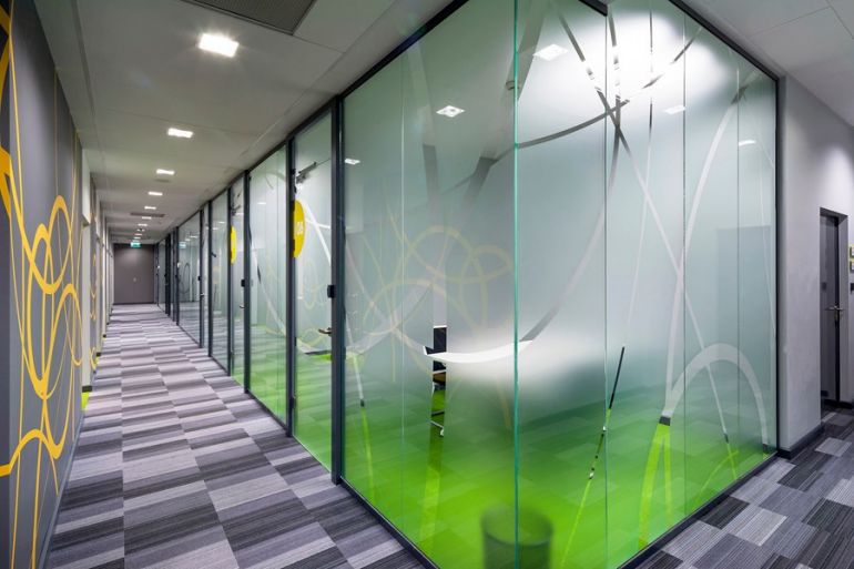
The aim of architects was to develop space full of light and color, filled with elements which create lightness and build a friendly atmosphere which allows employees to feel freedom. The office is filled with juicy colors – green, purple and orange. The leitmotif, however, are contours of overlapping circles, which are on photograph wallpapers and foil panes imitating sand glass and in office marking systems. In the project, the combination of vivid colors in various sets was applied. A dominant color has been changing against others while maintaining the uniformity of graphic motives, depending on the functional zone or range of space – points out Krzysztof Skłodowski. Large tiles of clear glass and white as well as varnished mdf were to provide cleanliness and sterility – adds Monika Gardasiewicz from Advertis Group.
Information – decoration
Statements and information about strategy and development of the company, which cover large spaces of grey walls, are important elements of the arrangement of the Main Office of Jeronimo Martins. There is a logo of Jeronimo Martins above the reception which is made of stainless steel on glass. Moreover, trademarks of brands which are members of the group were exposed. After coming to the reception, visitors turn their eyes towards a map of Poland with marked locations of Biedronka shops, which is also equipped with an electronic meter of chain range. That installation was made with the use of a direct overprint on glass with marked labels in the form of three-dimensional ladybirds.
In another room – quest zone, LED highlight pole with replaceable graphics was situated, on which assumptions of CSR company as well as pillars of its activities are presented. Furthermore, prizes and trophies are exhibited in modern and freestanding exposures. Traditional situating diplomas and thanks on walls was replaced by composition with frames on a glass tile. We wanted the space to be a carrier of information about business success of the company. Currently, each area is a business card of the brand. Entering into another rooms, we find out more and more about the host, we learn about the history of the company – comments Paweł Gardasiewicz, chairman of Advertis Group.
Polish and Portuguese integration
There are also elements in the Main Office of Jeronimo Martins which connect Portugal, a country where the brand originated, with Poland. These are two canteens – one with southern character and the other more Polish – in arrangement and kind of serving dishes.
KSArchitekci studio, developed by Krzysztof Skłodowski, was responsible for the project and complex arrangement of office space. Advertis Group, in turn, performed elements of new arrangement of reception and management zones as well as identification of office and information system.