


In short, sometimes you do not have to rebuild the entire space; all you have to do is to change few elements and thus you can obtain new quality. Is that correct?
Indeed. The previously mentioned flooring is a good example of that. The flooring was improved by adding some new floor plinths and sidings. What is more, we did not introduce many elements in the hall space when it comes to permanent development such as the walls. The earlier designs envisaged permanent compartments, however, we resigned from them in the final project. Thereby, we maintained coherent space and, at the same time, two different zones were optically divided.
Which zones were divided in result of this rearrangement?
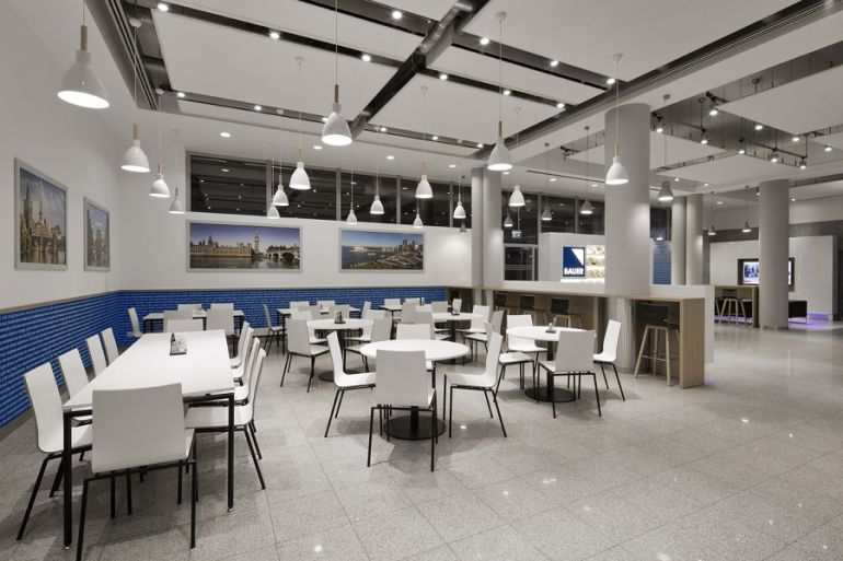
All zones actually existed before. They were: entrance zone, reception, elevator hall, dining room and vanishing waiting zone. We divided this space into similar zones so that it could perform the same functions as before. Hence, we have a new entrance zone with reception, elevators hall, waiting zone, or dining zone connected with coffee point. Everything is functionally combined in space. We divided the zones without using permanent developments such as walls or glazings. Instead, we used optical division through different compartments, for instance, suspended desk, or higher furniture. Therefore, the eye contact is still maintained on this area, and the place is coherent, despite a number of functions it performs. The heart of the entire space is an exhibition wall, which is placed on the entrance's axis. It concatenates this design.
Can we say that the exhibition wall is the most interesting element of this space?
The exhibition wall was performed as the last element. We have been searching for a central element, wondering what should be placed there. The investor's help turned out to be invaluable in this matter. We managed to incorporate the exhibition wall into the existing development, and, indeed, it is a kind of element which joins all these parts.
Why did you choose classic coloring while designing this space?
First and foremost, the investor valued simplicity. It was about refurbishment of this space, and not about a shock treatment related to the complete change of the looks. We applied classic colors such as white, black and grey. There are also wooden elements, which are to warm up the interior. It was crucial not to overwhelm this space. Additionally, there are elements, the coloring of which results from the color of the publishing house's logo. It is present in the form of accents on the entire space.